
Is white the worst colour for low ceilings?
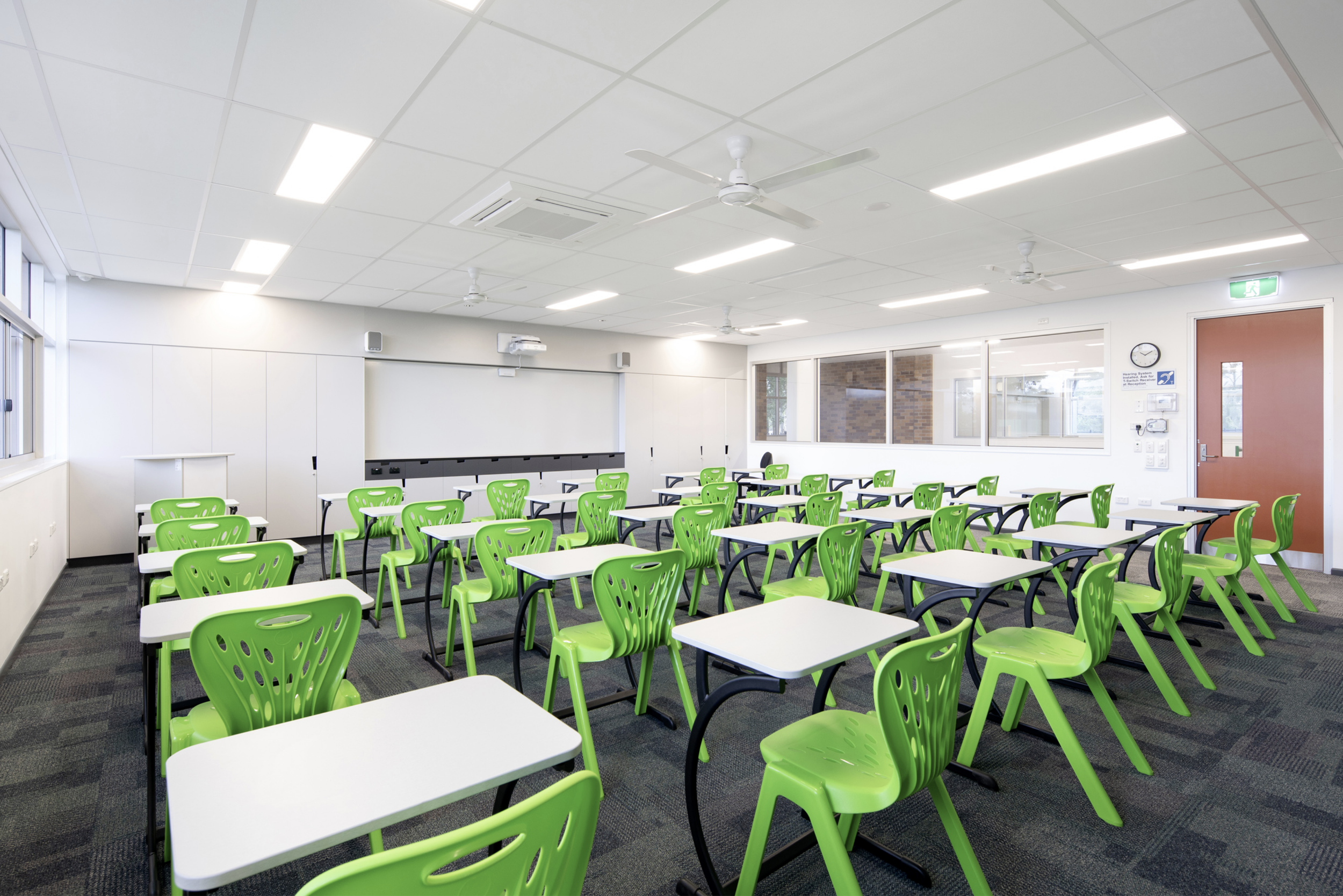
Contrary to what (almost) everyone thinks, a low ceiling does not look higher if painted white. While it may bounce more light around the room, that is actually a separate concern.
The brightest surface is usually the one we pay most attention to. So, if a ceiling is low, but bright and white, it tends to take up a lot of our attention - even if this is at a semi or sub-conscious level - we sense the proximity of the ceiling keenly.
If the ceiling is white but under-lit and gloomy, that’s also a huge negative, exacerbating feelings of being cramped, constrained or trapped.
A lot of ceilings I see painted white seem to have to little material relationship at all with the rest of the interior finishes palette - it’s obvious that the decision was a reflex or out of habit, rather than a thoughtful design decision.
When you can’t have height or the budget is limited - what can you do with your ceilings?
Using colour is one of the techniques I have been experimenting with for many years now. It’s so simple, and yet the effects are profound!
After 5 weeks in Europe, I feel even more inspired and excited about ceilings than usual! Visiting one very famous Basilica, watching the streams of people queuing, photographing and gaping reinforced my belief that people crave beauty, and if it’s overhead, all the better.
Human beings are inspired and delighted by beautiful things, made with care and purpose. So why do we think that ugliness won’t affect us negatively?
I’ve heard all the excuses against colour on ceilings:
Won’t the downlights stand out too much?
Won't the smoke alarm look weird?
Won't the room look smaller?
Will it make the room dark?
But the curtain track only comes in black or white...
After 15 years of practice, I have many solutions, strategies, tricks and inspiration to share. If you need a reminder about all the alternatives there are for boring white ceilings – take a look at my Pinterest board Colour: Ceilings.