
Struck dumb by the humble potato: lessons on architectural colour
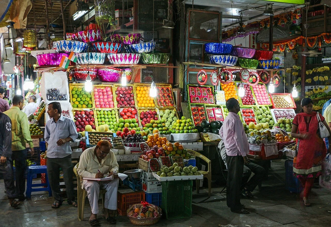
I’ve never forgotten strolling through Mumbai’s famous Crawford Market 30 years ago, and being struck dumb by the beauty of potatoes and onions.
Surrounded by the market’s cacophony of riotous colour and movement, where literally everything was shouting for my attention, the thing that got it was quiet, simple, elegant and probably the most humble offering in the entire place.
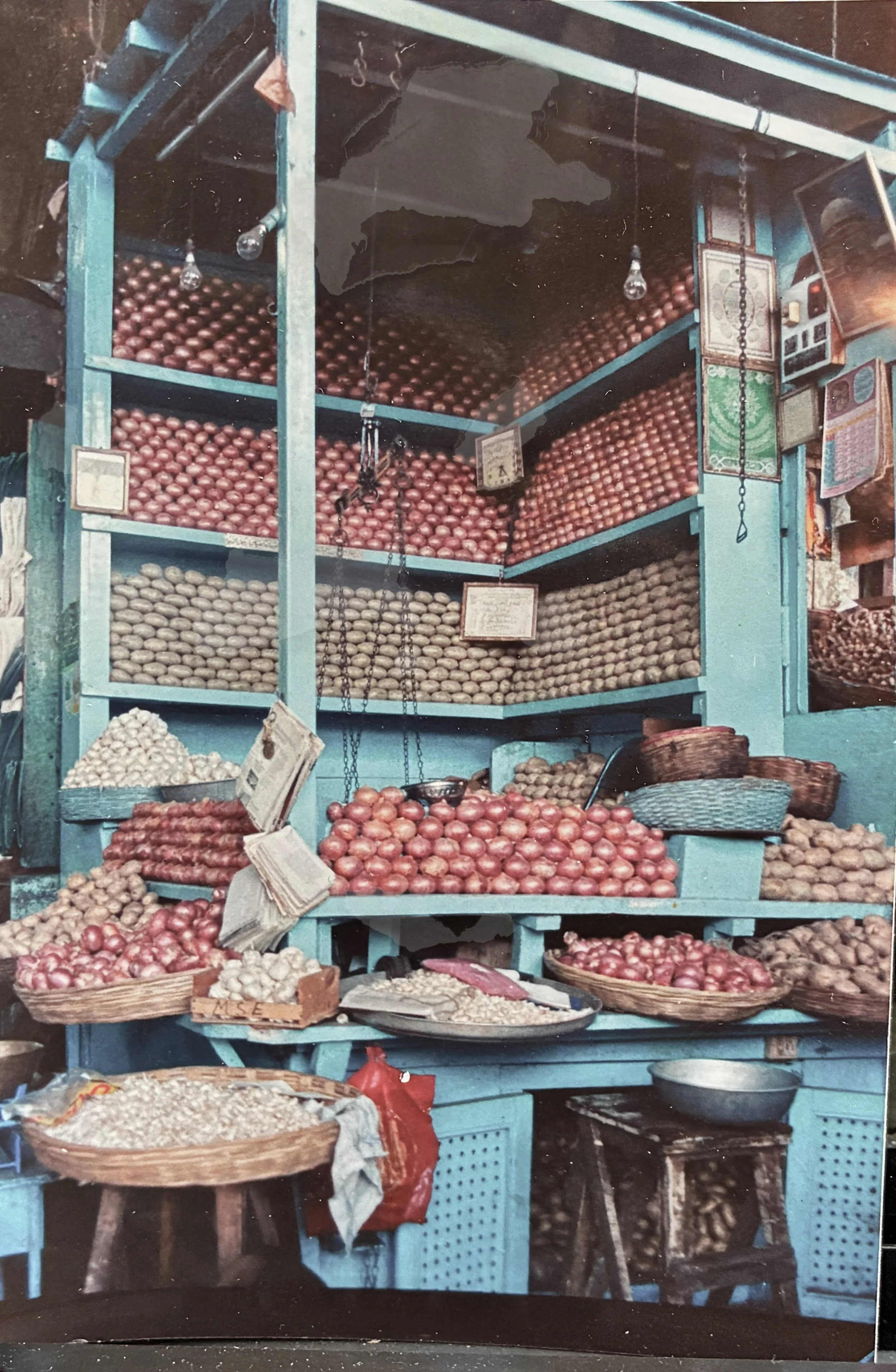
Standing before it, I was absolutely fascinated that a stall selling small brown lumps could be so beautiful and so striking in this visually intense environment. At the risk of sounding like a lunatic, I found it intensely moving.
The attention given to the display of each vegetable demonstrated an extraordinary amount of pride and care for food items we rarely get excited about. I mean, they’re always just there, aren’t they? A perfectly vine ripened tomato, or juicy peach - yes, they’re exciting. But an onion or potato? We toss them in the shopping cart and move on.
But here’s what really thrilled me. The light blue colour used to paint the stall’s makeshift shelves and platforms. Genius.
Against the blue, rosy brown onion skins looked particularly handsome. Dusty brown potatoes further ennobled by their fastidious arrangement, like bricks in a wall…stretcher bond spuds!
This inspired choice of colour created a perfect setting for the produce. In the context of the colour saturated market, this stall stood out by whispering elegantly.
There’s clever things happening here - the particular shade of blue that makes the dull brown vegetables look their best, and secondly, no attempt to compete with the other stalls for colourfulness - rather the response amidst a lot of noise is to be quiet, with conviction.
What did I learn from the potato and onion stall that applies to architecture?
One well-selected colour can create a strong and elegant impression, providing a background that holds everything else together.
A single colour can make an assemblage of sticks and planks look intentional and cohesive. (Nothing like a coat of paint to unify heterogeneous materials.)
Relationally - To stand out in a noisy visual environment, being quiet is often the best strategy. The context drives colour the response.
Dynamically, harmonious opposites work, and can help to reinforce ideas of solid and void, heaviness and lightness, earth and sky.
There’s a lot to love about blue and brown!