
Mass produced apartments always feature generic, bland colour schemes. Although they’re usually painted stark white, they generally feel grey and drab. It’s only when strong sunlight hits a walls that things feel bright enough. The rest of the time, these cookie cutter interiors display a persistent dullness.
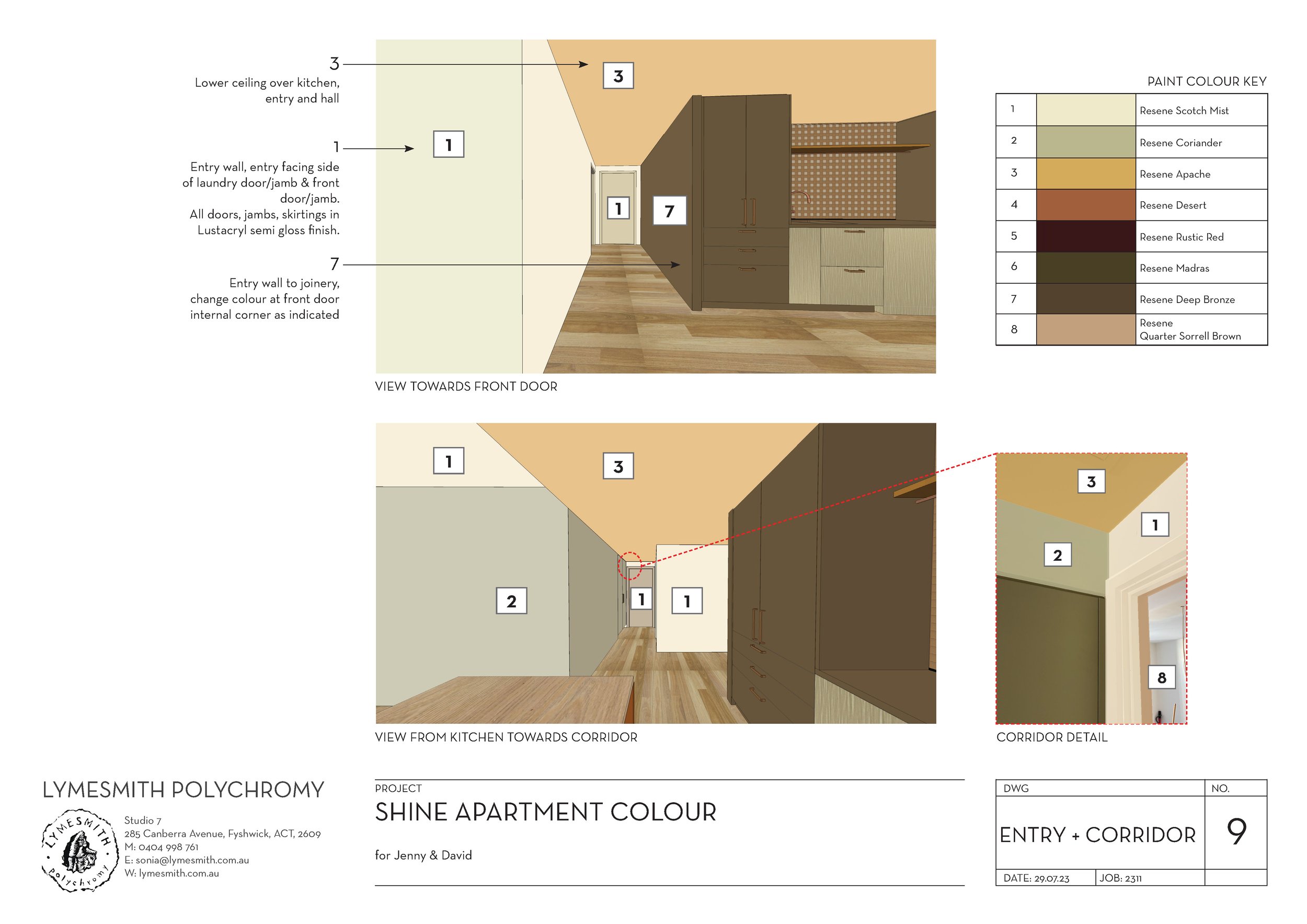
This was the case in Jenny Edward’s 20-yr old apartment. I worked with Jenny and her partner, David on a ‘light-touch’ renovation. Together, we turned their cold, tired apartment into a warm and joyful home by introducing colour (in the form of paint and laminate) and reclaimed timber.
When Anna Cumming of Renew Magazine asked Jenny, “What was the biggest win of this project?, she replied; '“Oh, my… It's the whole package. My small, pokey apartment has become this journey. Every day, it is genuinely delightful. I cannot stress how profound the impact has been on how I feel in this place. It's really incredible.”
Transforming a small space
If you want to learn more about how you can transform your small space with the power of colour, watch my recent conversation with Jenny for Renew Magazine. We discuss the transformation of her 20-yr old apartment in more detail and I share my tips for making the most of colour in your home.
Colour as a spatial practice
There is no architecture without colour. Everything we can perceive has some or other colour property. And yes, I consider black, white and grey to be colours too.
When I studied visual arts, colour was a visual practice. After I studied architecture, I began to think of colour as a spatial practice.
Emerging research increasingly shows that colours act on the human nervous system. Good colour design can help people with dementia navigate their living spaces and even their cities more independently. Appropriate use of colour assists people with cognitive differences. Colour has potential applications beyond just making us feel good. These are not trivial matters.
I’m interested in using colour to make buildings better for human beings.
Applying this to trauma-informed design
With trauma-informed design, I pay attention to the physical body and the nervous system, using colour and materials to help people feel grounded and connected.
Bodies under extreme stress, or after trauma, can experience disconnection from their physical selves, and can experience disassociation from place. Part of healing and regulating the traumatised nervous system is through returning to the body.
Working with Core Collective, Christopher Clinton Architects, and SBLA Studio, I developed a trauma-informed approach to colour and materiality for prototype houses for the Hobart Women's Shelter. The homes are located on a beautiful site where you can see the river, mountains and trees. Human beings have evolved in close and complex relationship with the natural world. Our brains function better when stimulated and soothed by interaction with complex natural systems. Therefore, every material and colour that we used was selected in relation to that environment, helping survivors find connection with the outside to feel calm and secure.
Every woman who has lived in the homes has felt and commented on the beautiful relationship between architecture and place, and has noticed the calming effects on their nervous systems.

“The colours of the landscape and the houses look so beautiful together, it’s very calming”
“[The round window] changes colour whenever the sky changes. That window is like a moving picture. That’s my favourite thing.”
ELSIE & ISABEL RESIDENTS